Subscriber LTV Dashboard
Problem
How might we better inform our merchants how their SMS campaigns perform?
Research & Discovery
As an organization, Postscript is focused on providing our merchants with all the tools necessary to create sound SMS marketing strategies. Through years of internal research, we have developed a sophisticated series of metrics that aim to inform our merchants on how their SMS strategy is performing. We call them ARM-U:
Acquisition Rate
How efficiently are you growing your subscriber list?
Revenue per Message
Sending millions of SMS messages is expensive. Are you earning more from SMS than you are spending?
Messages per Subscriber
How often are you engaging with your customers via SMS?
Unsubscribe Rate
How healthy is your subscriber churn rate?
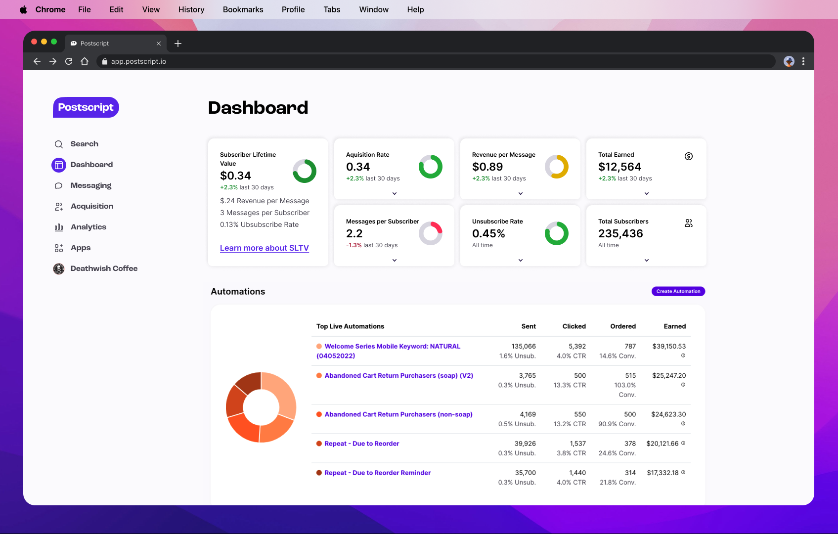
Using these four metrics, we then combined them all into a unique formula which resulted in a metric representing Subscriber Lifetime Value (S-LTV). S-LTV created a new area of importance for our team and had remained a consistent point of emphasis during customer calls and interviews. Informing our merchants of their SMS performance is something we already do in our app, but how can we expand on what already exists on our dashboard? Using the current dashboard as a starting point, I know I needed to design a new component to house the data. As seen in the screenshot below, the widgets on the dashboard were legacy, and not included in our design system.
Hypothesis and Goals
We believe that displaying metrics regarding subscriber lifetime value to our merchants will result in the increase of messages sent via SMS campaigns, because we know the importance of efficient and powerful SMS marketing strategies.
Our goal for introducing the new dashboard is twofold:
We want to funnel merchants towards campaign creation to send more messages.
We expect to see increased engagement with S-LTV metrics, and any ARM-U metric that isn’t performing in “the green”.
Team
The Core Experience team at Postscript took on this project, with myself serving as the sole designer.
Product Designer (Me!)
Product Manager
Engineering Manager
Two frontend developers
Two backend developers
Our PM, EM, and I formed our team “triad” and would meet weekly to discuss strategy, speedbumps, and project performance against team OKRs.
A screenshot of our legacy dashboard.
Ideation & Brainstorming
To solve the problem of enhancing our dashboard, I needed to ideate how to display new metrics for S-LTV on the dashboard, while also creating a new global component for our design system. The need for a “data card” had previously been discussed by a product design team, and this was a perfect opportunity to make a new component.
I needed two variants of data cards:
For ARM-U metrics, I needed a “sliding scale” or other signifiers that communicated to the user how healthy that particular metric is performing.
For basic metrics, I needed to effectively display important information (like total earned and subscriber counts).
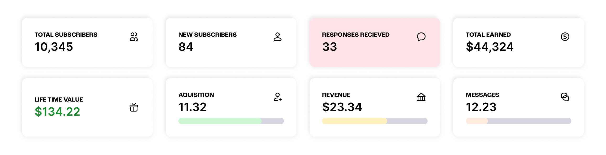
Initial attempts at both variants of data cards. At this stage, it was clear that I needed to cut down on the amount of widgets, and better organize the information.
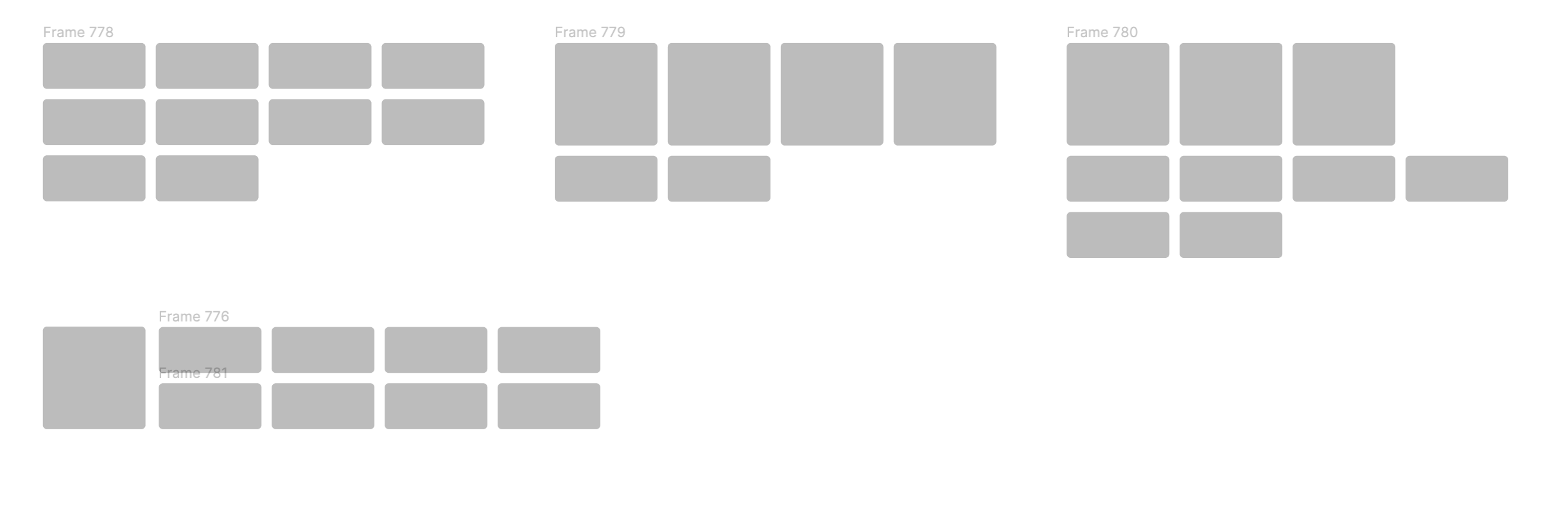
Experimentation for data card layouts on the dashboard.
Design
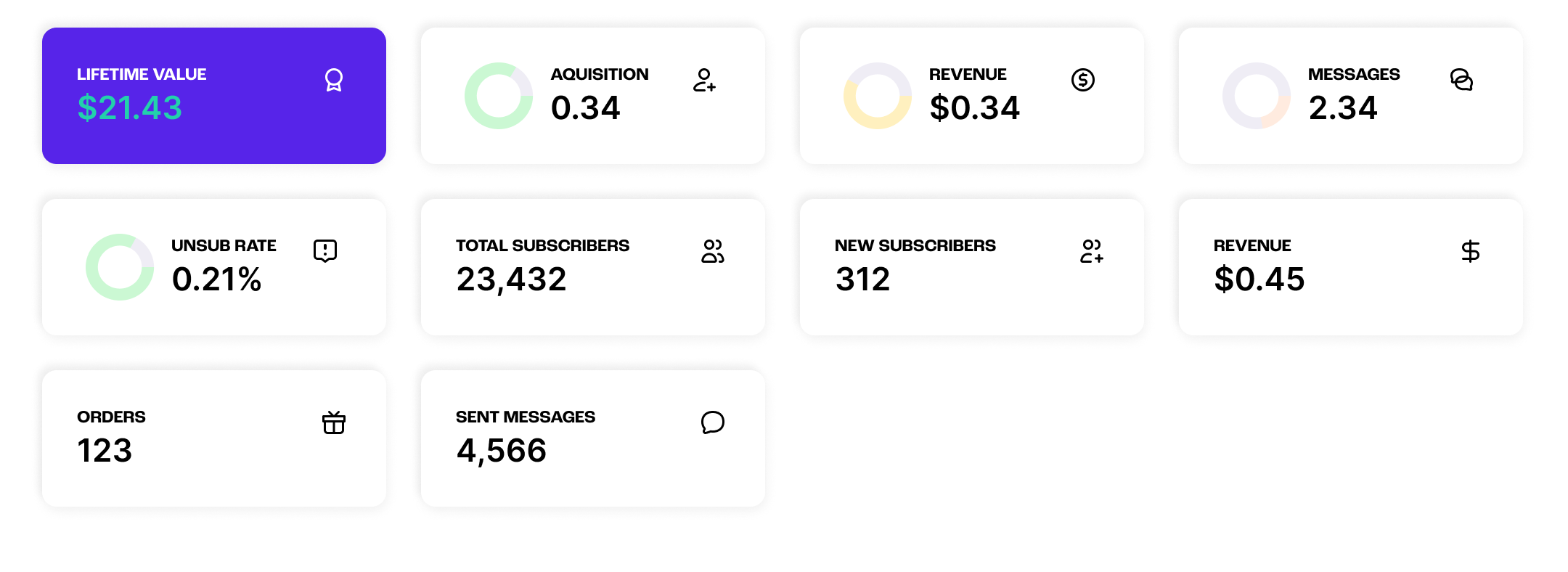
After presenting these initial ideas for critique, I focused next on the hierarchy and organization of the dashboard. Highlighting the S-LTV and ARM-U data cards became a priority, as well as finding a cohesive organizational structure for the cards. I also settled on donut charts as an MVP visual for the ARM-U cards. The color contrast was increased, allowing the cards of higher importance to stand out more from the others and immediately draw the user’s attention to any metric performing in the “red.”
I also introduced an accordion to the cards as a variant. The accordion saved up a ton of vertical spacing at the top of the dashboard while providing valuable interaction for data cards in other locations throughout our app.
Further experimentation of the layout for the data cards resulted in an S-LTV card that is permanently in its expanded state. I hypothesized that by making the S-LTV card larger, we would see increased clicks and interaction with the card. Providing a link at the bottom of the card also affords the user to learn more about how we calculate the S-LTV metric and perhaps begin to rethink how they strategize their SMS campaigns.
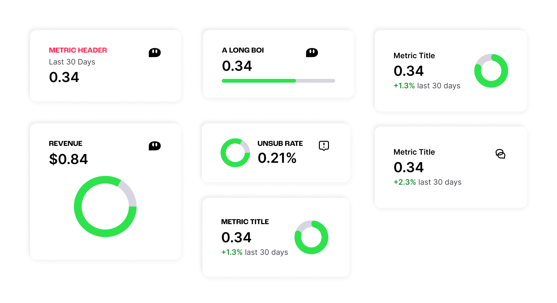
A selection of iterations on the data card. The final version can be seen on the right.
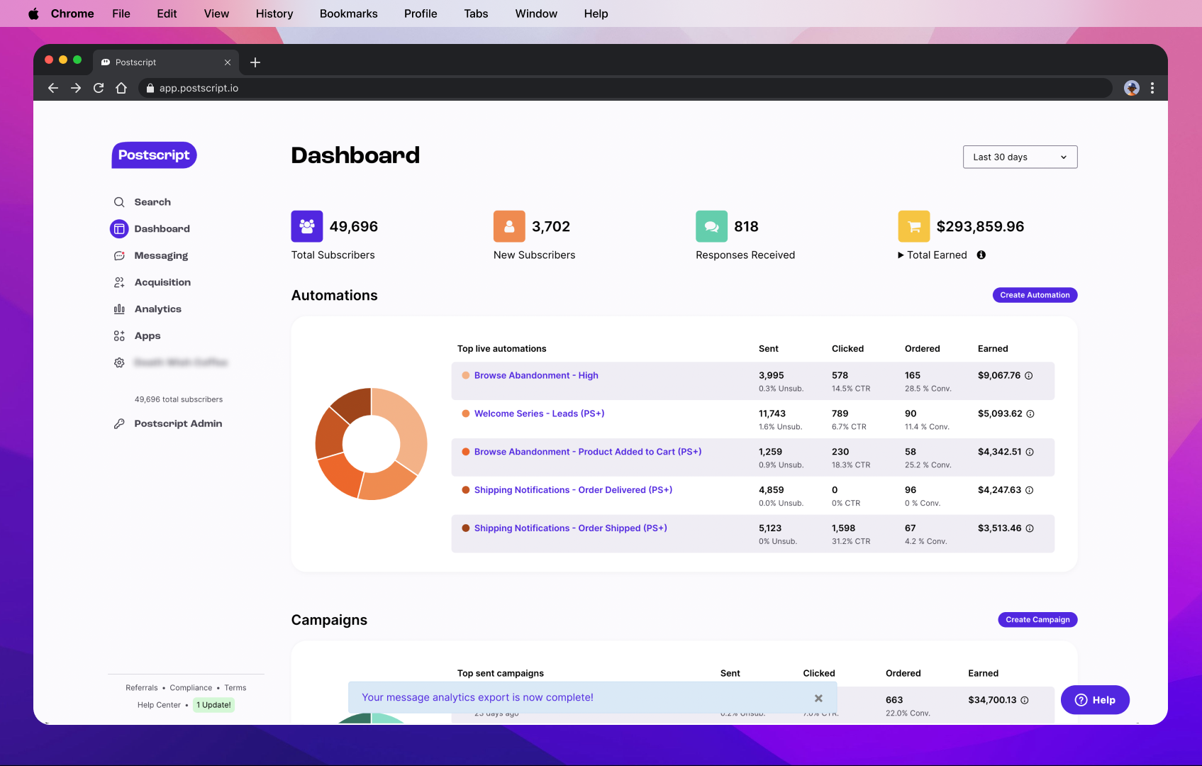
The final design for the dashboard includes a large card for S-LTV, colorful donut charts for each ARM-U card (colors adjusted for improved accessibility), and clickable accordions in each applicable card for viewing more data. The grid is also fully responsive, adjusting widths at specific breakpoints and adopting a “masonry” style grid when one accordion is clicked.
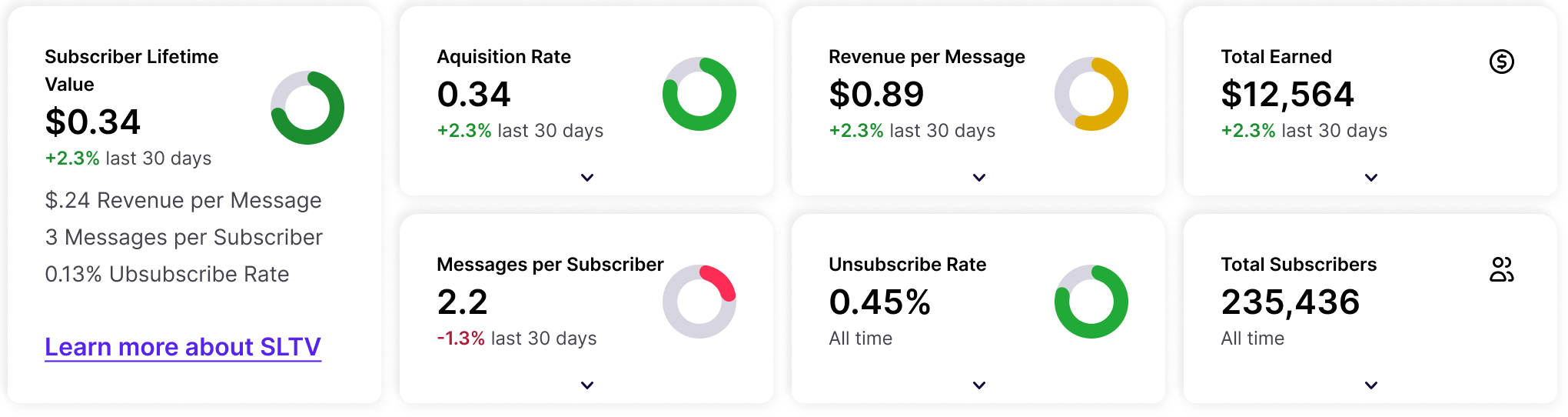
The final data card grid on the dashboard.
Below is a screen recording from production of how the dashboard responds at smaller breakpoints, as well as a demonstration of how the cards adopt a “masonry” grid when one or more cards expand after the user clicks an accordion.
Testing & Future Considerations
The new dashboard was tested both internally and with a select number of our customers. The most common response from our customers was strong emotional responses after seeing that one of their ARM-U metrics was not performing at an ideal level.
Amplitude dashboards were also created to track user behavior after the dashboard’s release, with key charts showing any increase in funneling to campaign creation, data card engagement, and observations into attempts to improve certain scores.
Some future iterations that we planned before my departure from Postscript include the addition of select menus in specific data cards to allow for exploration of the historical performance of SMS strategy. Additional considerations were also discussed for expanding on existing data tables below the data cards to better organize and structure data associated with Campaigns, Automations, and Subscriber Acquisition.
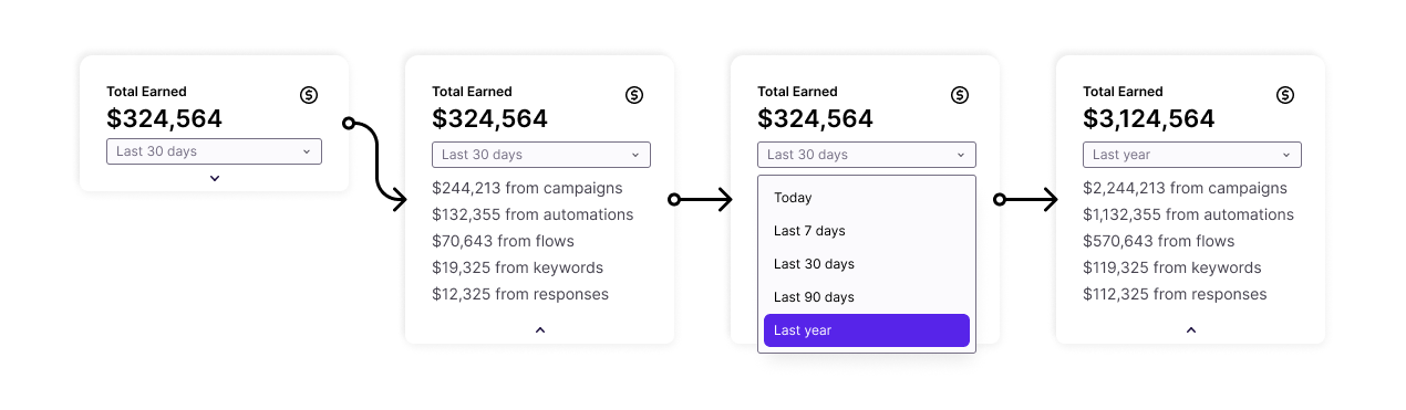
A flow for a future iteration of the Data Card